Consider our brand logo tips to keep you sharp! Your brand logo will follow you to your website, your press releases, corporate meetings, promotional material, outside your office and even on your social media. While that may sound daunting, creating a successful logo is more than achievable, just think of Apple, Nike and Google!
Finding a good logo designer is important if you want to communicate the following effectively. So whether you’re a budding business owner or a young logo design agency, these 7 expert logo tips will help your brand to stand out from the crowd for the right reasons. These should help your overall brand strategy.
When creating a killer logo, avoid the kaleidoscope effect. Brands like Nike showed us the power of keeping things simple. While every logo designer wants to showcase their creativity and skills, having too many fine details will just become confusing to the eye and defeats the purpose of a clear and impactful logo. Also, in places where your logo is scaled down, it’ll just look like a splodge.
Many companies think they’re reflecting their brand only to find that the mass population hasn’t quite connected the not-so-obvious dots. When people see your logo, they should be able to relate it back to your brand. Take it as an opportunity to bring out the personality of your brand – for example, if you’re a fun and creative company, stay clear of a logo that seems highly corporate.
One of the less considered logo tips but essential. Symbols can evoke emotions in all of us and it’s important that your brand logo conjures up thoughts and feelings that are positive. For example, if you were a company offering career progression to young people, you probably shouldn’t have a full stop as your logo. People like brands that make them feel good – it heightens trust value and encourages brand loyalty.
Do this early in your design process to avoid disappointment! As soon as you have a sketch of how you’re brand logo will look like, put in a reverse image search online to ensure no one’s using it. As far as logo tips go, this one may seem obvious but there are many brands out there that failed to consider this and ended up with similar logos. It can make it increasingly hard to distinguish yourself from some of the other brands on the market and you could also lose out on potential customers.
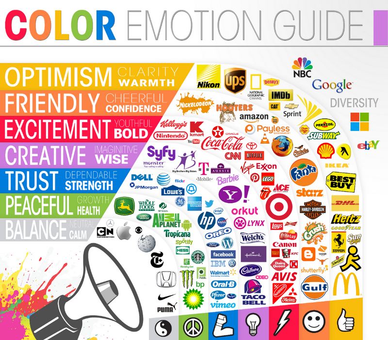
Think of colours that work well together but don’t go overboard – having 2 to 3 colours is generally recommended. Any more than that you’ll run the risk of it looking amateur as well as it being more costly to print which may not be in your budget if you’re a start-up company.
We’d also like to point out the psychology of colours here – did you know that blue is often associated with values such as trustworthiness? Think it is all nonsense? We wouldn’t say that to the scientists who have spent years studying the way we react to colours!

This goes for the design and the printing. Sadly the phrase “don’t judge a book by its cover” doesn’t exist in the marketing world. What people see is what leaves a lasting impression. It’s hard for a potential customer to imagine you’d do a good job for them if you haven’t done a good job on the face of your brand.
While we’ve listed some considerations to take when creating your brand logo, the only way to really know if people will like it is to ask them. A lot of logo design companies incorporate the feedback element in their design process.
It simply involves asking some questions to a representative sample of your key demographic and getting their views before you roll out your design across your existing platforms.
Choosing a marketing company is never easy, as there are so many in the UK to choose from.
If you’re looking for a logo design agency, simply fill out a form and we can find you top agencies in your desired location. You’ll receive 5 price quotes from agencies who would love to work on your logo – you’re under no obligation to choose.